Wildsound


Immerse yourself in nature's unique soundscapes, connecting with rivers and rainforests from around the world.

modes
river sounds
rainforest sounds


Discover your next wildsound
Relax with WildSound's serene river and rainforest sounds and enjoy a dynamic, immersive experience with customizable intensity and intention filters. The modern world has distanced us from nature, particularly the life-giving soundscapes of rivers and rainforests. WildSound offers authentic soundscapes from named and geolocated rivers and rainforests while providing the means for users to participate in real-world conservation efforts with NGO partnerships.


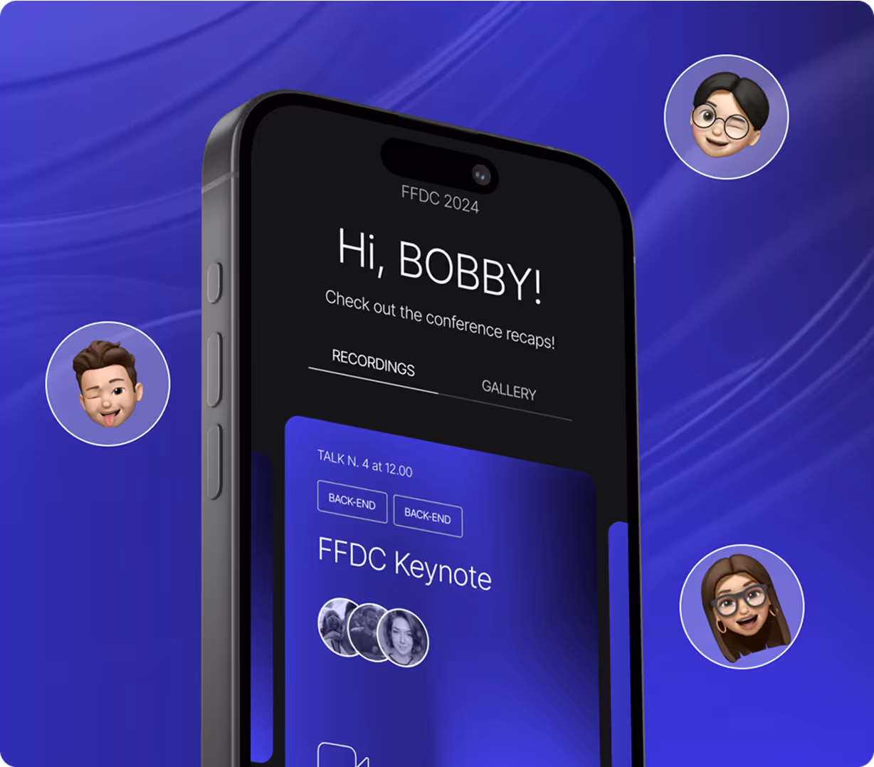
Building lasting relationships
“Working with Calda has been a fantastic experience. Their design skills and tech know-how are top-notch, communication is clear, and they really go the extra mile. They show real passion and make it feel like we’re all in this together.”
- Eric Druckenmiller, Product Owner


App Features
On the homepage, users are presented with an engaging choice between exploring Rivers or Rainforests. To make a selection, they simply press and hold their preferred option until a loading circle completes, adding a subtle interactive element to the experience. Beyond this, users can personalize the app by switching between light and dark mode and selecting an organization they wish to support, allowing for a more tailored and meaningful connection.
Enhancing the overall feel of the app is a thoughtful detail: as users tilt or move their phone, the river image on screen shifts accordingly, creating a sense of depth and immersion. Altogether, these features reflect a strong emphasis on user experience, combining smooth interaction, personalization, and visual engagement.


UX / UI Design
WildSound is designed with a clear purpose: to calm the user down and promote a mindful, slow-paced experience. In contrast to modern UX principles that prioritize speed, engagement loops, and keeping users constantly active within an app, WildSound intentionally takes the opposite approach. Every aspect of the app is crafted to encourage relaxation and presence. After developing thoughtful wireframes, we selected a design direction that reflects this philosophy.
The interface remains simple and uncluttered, with subtle touches of dark green to evoke the calming presence of nature. Two visual modes—light and dark—were created to align with users’ phone settings, offering a personalized experience. The goal was to balance a coherent and intuitive visual flow with a modern, aesthetically pleasing design that enhances rather than distracts from the app’s tranquil purpose.


Supabase & FlutterFlow
To support the client’s goal of scaling the application for users across the globe, we needed a tech stack that combined speed, flexibility, and scalability. Supabase was the obvious choice for the backend—it allowed us to move quickly while providing robust security and the ability to scale effortlessly, living up to its slogan: “Build in a weekend. Scale to millions.”
On the frontend, we chose FlutterFlow for its rapid development capabilities and seamless integration with Supabase. This combination enabled us to deliver a high-performing, scalable application without compromising on development speed or user experience.