
Did you know that the global font market might reach over $4 billion by 2025 and that choosing the right font can improve user experience by up to 40%?
75 Font Statistics: Usage and Market Analysis
When it comes to UX & UI design typography can’t be overlooked as it plays a crucial part in visual communication and without the right font no piece of your content will be readable or visually appealing.
At Calda, we understand the importance of strategically selecting our app's typography as a key factor in deeply engaging our users and creating a strong brand identity!
And, with the largest font selection, Google Fonts is an excellent solution for our designers and developers. But with so many options available it can be quite an overwhelming challenge to find the right fit for your app.
Through this blog, we will help you explore and find the best Google font for your mobile or web application, with guidance from our own experience in building engaging digital projects with the right Google font.
Why choose Google Fonts?
Google Fonts is a large collection of high-quality fonts that can be easily integrated into your web and app projects, due to the:
→ Accessibility and cost-efficiency
Free of charge for commercial use with no licenses required, suitable for projects of any scale.
Frequently Asked Questions about Licenses
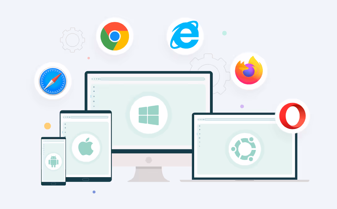
→ Seamless ease and cross-browser integration
Supporting integration on Android and iOS systems, along with compatibility across various web browsers.
→ Automatic updates
Ensuring compatibility and enhancements, keeping your projects up-to-date with the latest font technologies.
→ Reliability and safety
Strict Google security standards minimize the risks associated with web font integration and protect your projects from vulnerabilities.
→ Variety and versatility
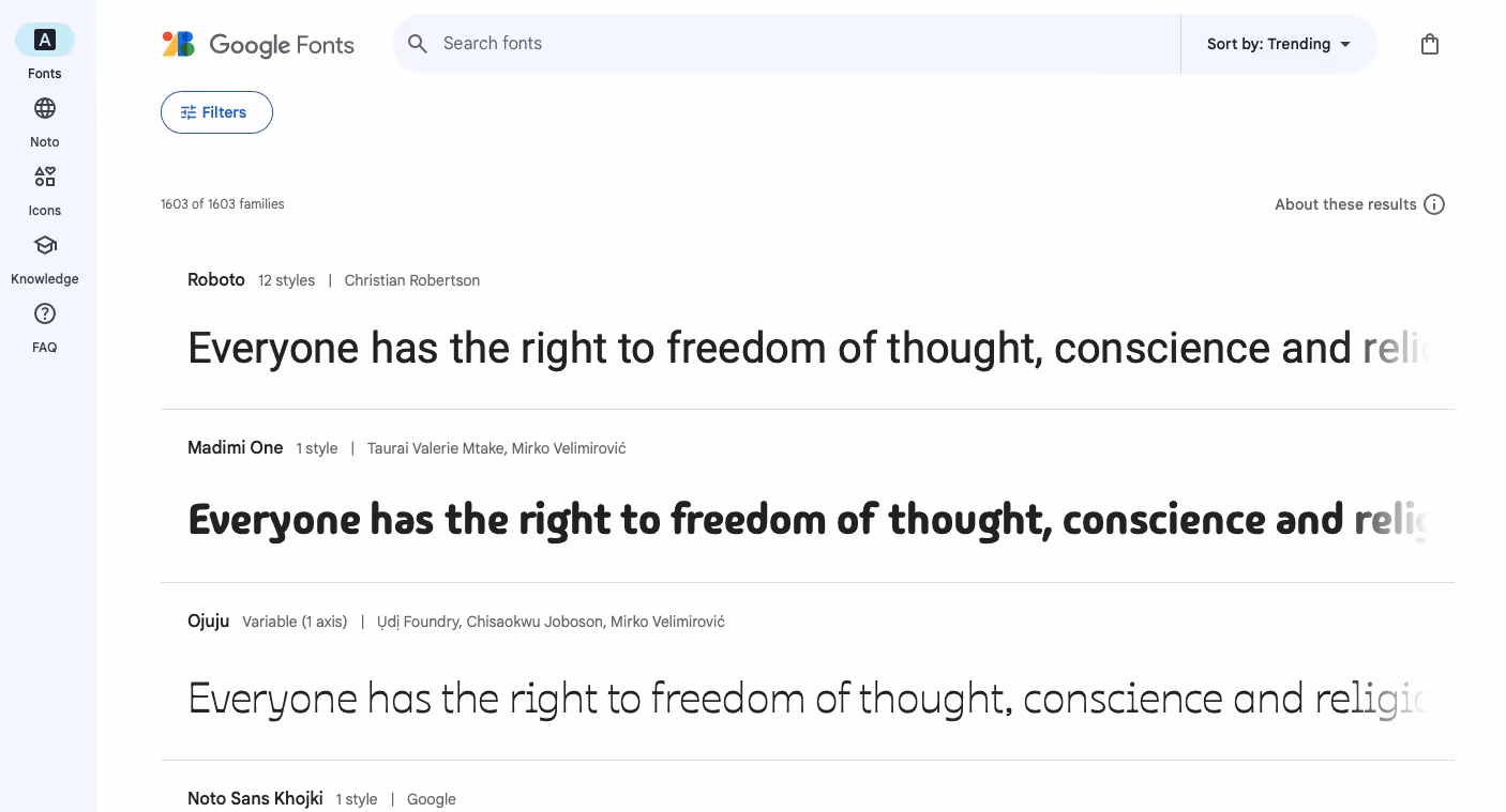
Providing over 1,600 font families across more than 150 writing systems, simplifying the process of selecting the font that aligns with brand aesthetics and project requirements.
5 Key factors when choosing a font
Readability and legibility
These are two fundamental factors, especially for UX/UI designers and businesses when selecting a font. Clear and easy-to-read fonts minimize user friction and enhance how well your users interact with your content.
High readability and legibility improve overall user experience, resulting in the success of your digital product by:
→ Increasing user retention
Since users are more likely to spend extended periods engaging with your content.
→ Boosting conversion rates
By streamlining the decision-making process, effectively guiding users towards the desired actions.
→ Reducing cognitive load
Simplifying the effort required to comprehend your content ensures a smoother, more intuitive user interaction.
→ Enhancing brand perception
The right font reflects your brand’s dedication to user satisfaction, positively influencing how users view your brand.
Screen scalability and responsiveness
By selecting responsive and scalable fonts that maintain readability and aesthetic appeal across different resolutions, devices and screen sizes, you ensure clarity, a consistent aesthetic, and a versatility – making your content accessible and engaging to users, regardless of how or where it's viewed.
Multilingual Support
Ensuring your content is accessible to a diverse audience with extensive Google Font language support broadens your global reach by universally accessible content.
Accessibility
Selecting fonts requires prioritizing accessibility to ensure everyone, including those with visual challenges like dyslexia, can easily engage with your content. By doing so, your content is more inclusive and user-friendly.
Future updates and support
Opt for fonts that are automatically regularly updated and supported, ensuring your content is compatible, up-to-date and secure.
Best Google Fonts for your digital project
Now that we've covered what to consider when choosing a font, the next step is to narrow down the choices.
Here are our top most used Google fonts that we used in plenty of our projects as they meet all the above criteria, making them successful.
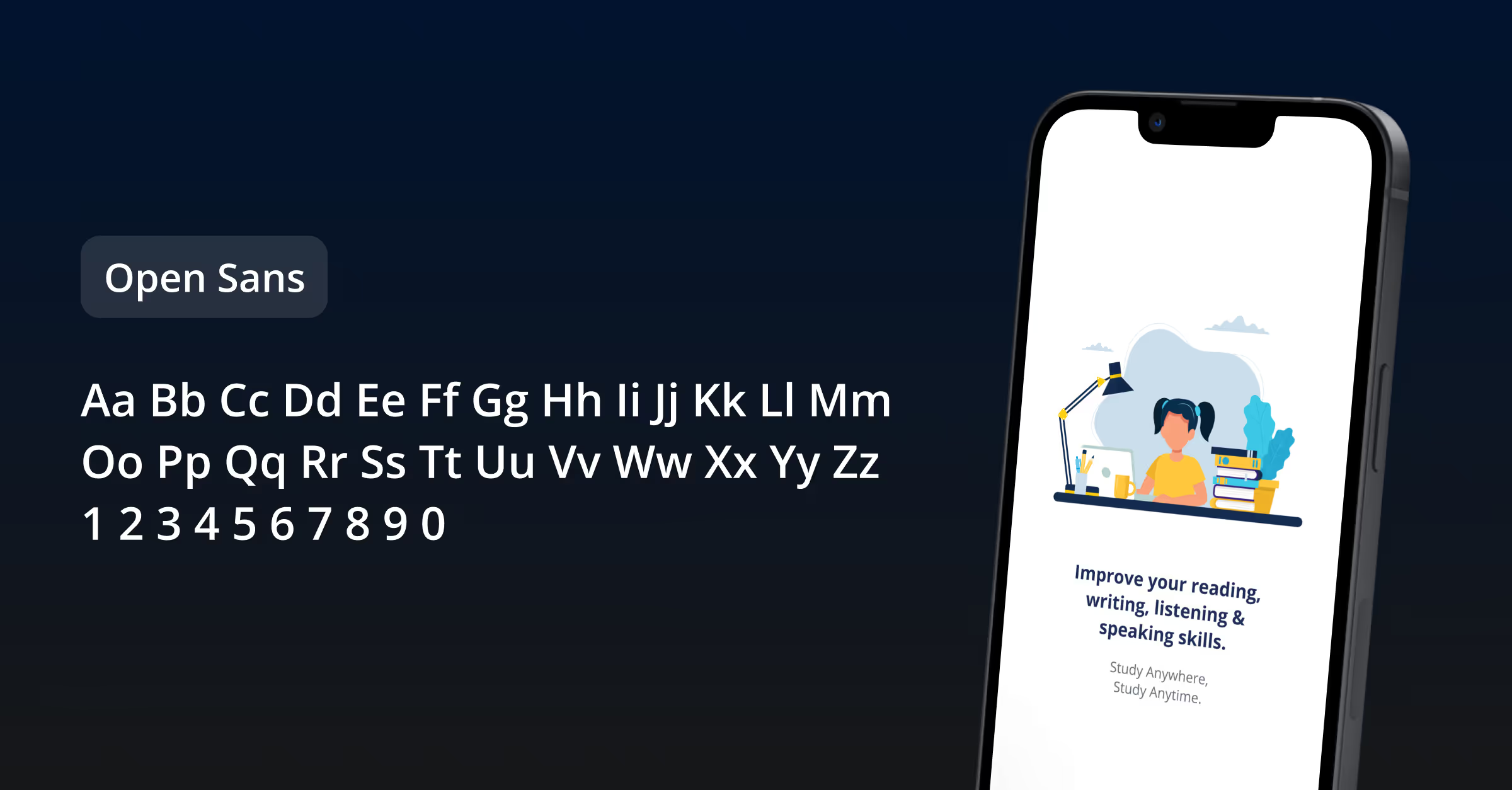
Open Sans
Open Sans is used in over 110 million websites and one of the top font choices of UX/UI designers. We choose Open Sans for many of our projects because of its excellent readability and versatility across various digital displays and devices. Its clean and simple design promotes a seamless user experience, making content easy to scan and understand, which is essential for engaging user interfaces.
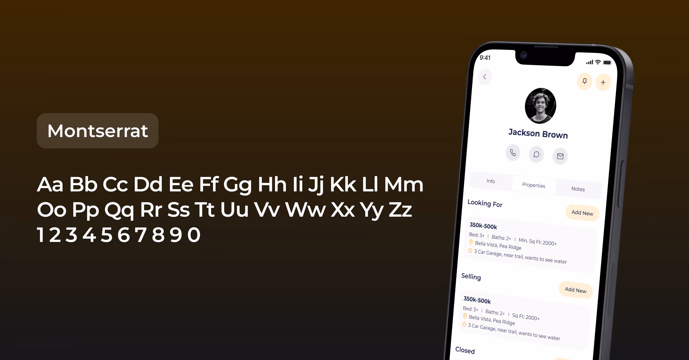
Montserrat
With 9.95 billion uses per week, Montserrat stands out as a more contemporary font. Its unique geometric and modern style captures attention with its visual appeal and that is precisely why we picked it for the Client Keeper app.
Its popularity creates broad acceptance and adaptability across various contexts, making it a reliable choice for achieving a modern vibe that attracts a diverse audience.
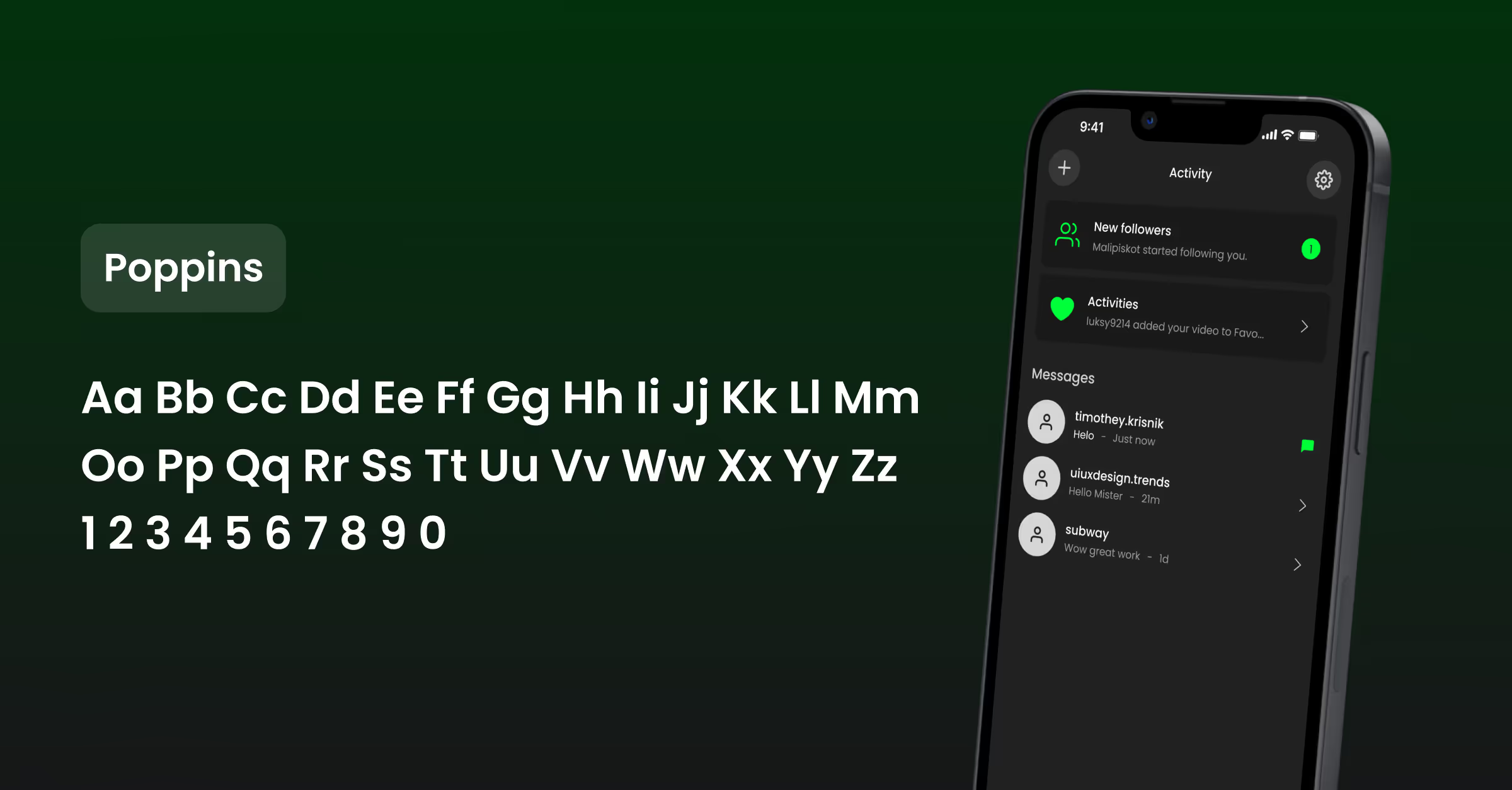
Poppins
Poppins is a newer font that instantly became popular due to its sleek appearance and minimal design. We opted for Poppins in a new-age social media app we built to leverage its clear and simple appearance, which significantly improved the user experience and aligned with the brand's personality.
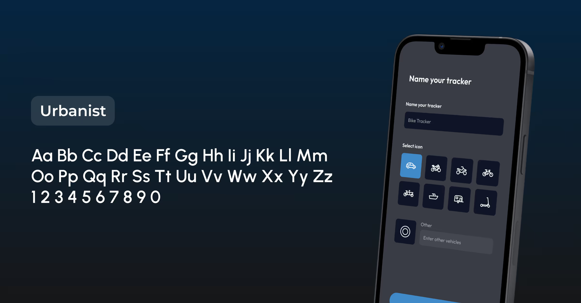
Urbanist
Launched in 2020, Urbanist blends modernist styling with classic design elements. This font is ideal for modern digital projects thanks to its adaptability and readability, making it especially suited for our web designs.
The right font does more than just display text; it communicates, engages, and leaves a lasting impression!
To meet the full potential of these fonts you need to find the balance between accessible, aesthetic and easy-to-read fonts that will capture the brand's identity, enhancing the overall usability and appeal of your application – seamlessly guiding your users through your content with ease and clarity.